We’d like to introduce you to our new brand. As this 114-year-old newspaper evolves into a global media company, our brand mark needed its own make-over.
The South China Morning Post is now available across countless channels, platforms, and formats, and our logo must be recognisable and adaptable across all of them. It must also tell our story, representing the company’s roots, legacy, and future.
All this in a simple, timeless symbol. We hope you will love it as much as we do.
Inspired by Hong Kong’s rich maritime heritage, our new logo is an iteration of the international signal flag Kilo. These flags have been flown since the mid-19th century to communicate across distances and languages. When raised in sequence, Kilo represents the letter “K”, but when hoisted by itself, it means “I want to communicate with you”. Indeed, there are few better ways to describe the purpose of a news company like the South China Morning Post.
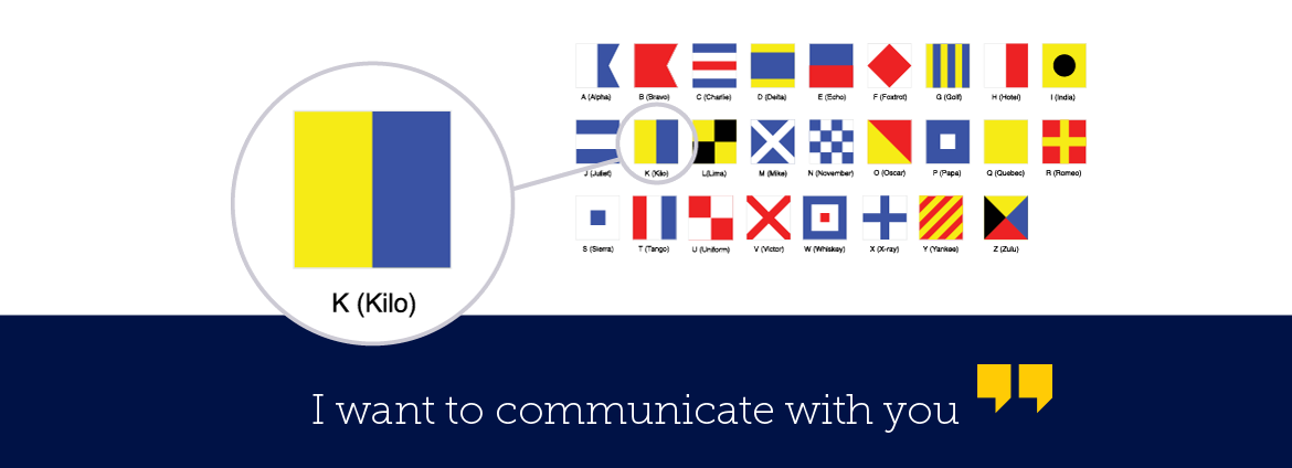
It is often said that a newspaper is “a window to the world”, and we hold that accountability with great respect and care. As a constant reminder of this responsibility, we have separated our flag into two frames, representing two sides to every story, both of which must be understood to find Truth and Fairness.
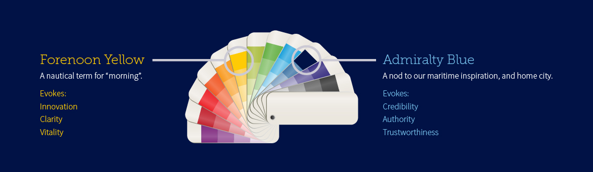
We chose two new colours that best represent our values as a company, and we named them for our inspiration and home city.
Many artists have proportioned their works to approximate the golden ratio, believing this proportion to be aesthetically pleasing. The golden ratio appears in many of nature’s patterns including the spiral arrangement of leaves and other plant parts.
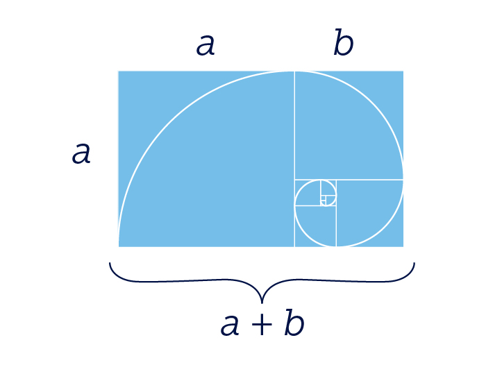
The construction of our new brand identity conforms to this mathematical formula.

Finally, we take pride in our legacy as a print publisher, so our new identity pays tribute to our heritage and is rendered in motion graphics as a visualisation of the opening of a broadsheet newspaper.
As we transform our brand identity, our broadsheet newspaper has also been redesigned with a simple goal: greater clarity. We believe that the clear presentation of facts is sacrosanct for the South China Morning Post, especially in today’s world of complexity, and it must be enshrined in our product design.

This evolution of our 114-year-old newspaper is marked by both legacy and modernity: a strong masthead that sits above a clean and bold presentation of news, with a return to serif headlines, rooting us in our heritage of world class journalism.
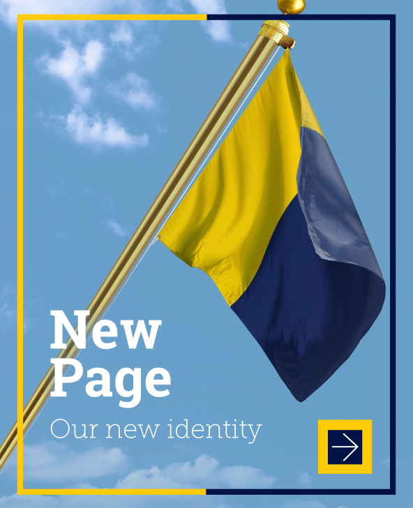
We look forward to the next chapter, turning a New Page with the conviction that media can inspire and Elevate Thought, each and every day.